Total Pageviews

Saturday, December 4, 2010

Week 9) Lab 8 - Race Distribution Analysis according to US Census

MAPPING RACES DISTRIBUTION IN THE US

1 - Presence of White Population within US Counties

White people are the predominant race in the US for both average percentage upon total within the Counties, total population and Homogeneity of distribution. As showed by the above map in blue color tones, Whites have a high share of population on almost every county, except some sparse, isolated group of counties within Continental US and Alaska. White Race populated every single county of the Nation, growing in number in every climate conditions.
Despite this huge diffusion gained in several centuries of occupation, white race still prefers temperate/cold temperate climates, even if basically the difference in percentage is due to the fact that other races of the US only live in certain areas, while whites have an equal absolute distribution in term of number. This means that while Whites have been able to sprawl and grow everywhere, other races, for political, colonialism and anthropological reasons, settled or grow only on certain areas of the Nation.
This however does not apply to biggest and then most globalized cities such as Los Angeles, New York, Dallas or many others, where the distribution and share cake of every race is more equal.
Overall, at the year 2000, whites were the 75% of the total population with 211.6 millions individuals and had a Mean Average per county of 84.4% of the share.

2 - Presence of Afro-american Population within US Counties

Figure/Map two shows the distribution of Afro-americans within the US Counties. This is certainly the data showing the strongest geographical trend. Literally, south-east counties are those where Blacks have been relegated to live and work after coming from African coasts during colonialism times. In certain counties counties of Alabama, Louisiana and Georgia, Blacks are more than 2/3 of total population. Overall, the percentage of total population at the year 2000 was only 12.32% for them, with a Mean per County of 8.9%, 9.5 less time than Whites compared with a 6.5 less total population. This is because in many northern and central states and counties blacks are often less than 1% of the population share. Again, in biggest cities the number tends to be closed to the actual absolute value for the US overall.

3 - Presence of Asian-american Population within US Counties
The Map in Figure 3 let us understanding the distribution and dynamics of Asian growth and sprawl towards the US. The Red an Orange cells represent Counties with higher Asian population.
As it is possible to see, Western coastal counties and biggest cities of the rest of the Nation have higher Asian population share.
As with Black Americans, Asian population distribution has to do with historical dynamics of the US. Asians came into america in the second half of XIX century, at the time of Gold rush in Western States. Since then, the resident population resided in those counties and grow until today's rates of about 10-50%. Also, additional migrants came during the last 100 years and brought the total population of Asians to be the third race in all the US at over 10 million individuals in year 2000.
Also, the biggest effect of this dynamic is that they are very concentrated into Californian, Washington, Arizona and Nevada's States in the West, and other main cities in the Eastern states. Asians tend to sprawl and grow today in places more interconnected into the global network, as it is possible to see from the map. They are a relevant percentage in main cities and coastal areas of the US, and very well connected with areas connected to the global business network such as New York, Dallas or San Francisco.

4 - Presence of Native american Population within US Counties
Map 4 reflects a main event in North American History: Native Americans disappearance. Natives were more than 90% of population before XIX century, completely integrated into its ecosystem and overall less than 5 millions before the arrival of Europeans. After the contact of the two civilizations, Natives have been relegated into areas with less percentage of Whites. Whites and Natives have been basically in fight for many decades during the last centuries, resulting in a relegation of Native Americans toward mid-west states and counties of the US, where Indian Reserves and natural habitats are more conserved and White race less present. Natives in 2000 were less than 2.5 millions inhabitants on a total population of more than 281 millions, which means a 0.85% overall. Also, even in the counties where they are a large share of population, they NEVER reach the 50.0% percent of county's share, stuck at 47.7% in one county of Arizona. As an average, they are very diffused in Mid-West counties with a Mean of 1.9%. They are definitely the less present population in the US between all those studied.

3 - Presence of Other Races Population within US Counties

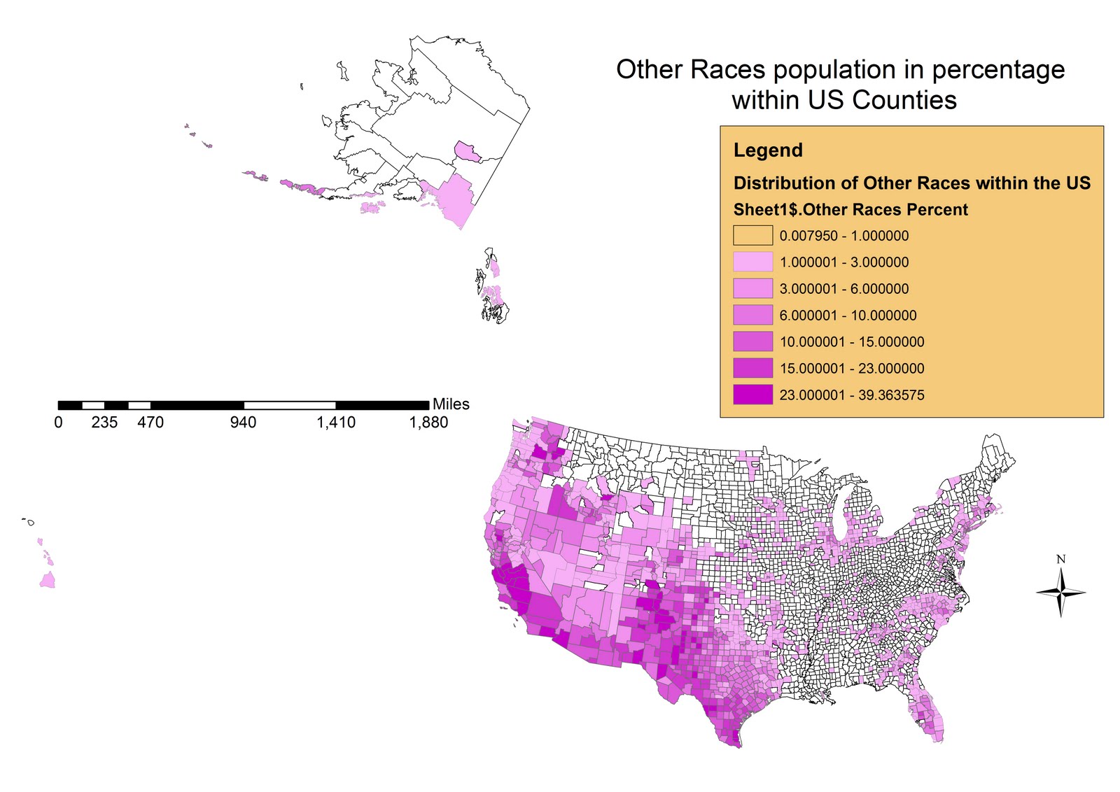
The last map (5th), identifies the presence of other races within the US Counties.
Normally this Census Category represents immigrants who came into the US from Latino-american and Carribbean countries. In fact, they are located mostly into South-Western states that are closer to the borders of countries such as Mexico which are the biggest origin countries for the highest percentage of US immigrants today. Southern California is one of the biggest receivers for individuals incoming from Mexico or Central America who represent the most recent ethnicity in the US immigration history. Despite their recent times, they are already the 15.58% of overall population in the US and 2.6% on every county as an average (mean). Also in this case, with the exception of Carribbean and Hispanic majority Counties, they never reach more than 1/3 of total local population, a character that identify their recent migration.

THE IMPORTANCE OF GIS

GIS are THE new, revolutionary tool of our IT generation. If we think at what changed during the last 10 or 5 years on this sector, we can see both how much this was useful and how much this is going to make the difference on our societies.
The wide range of applicability of these software, which we experienced during the lab sessions, has been very interesting and for sure is a factor of motivation when learning GIS.
Overall, the course was a very good introduction, with both technical and theoretical foundations on the discipline, and allowed us to learn gis tools with the motivation given by the facts that we analyzed during the course itself, such as wildfires, buffering areas of airports, etc.
I liked the approach we followed and for sure I am going to continue on learning GIS


Monday, November 22, 2010

Week 8) Lab 7 - Station Fire of 2009 in Los Angeles County

The STATION FIRE of 2009 in Los Angeles County

INTRODUCTION

The Angeles National Forest (ANF) is a mountainous habitat that is situated in the San Gabriel Mountains north of Los Angeles County. In August 2009, Station Fires decimated over 160,577 acres (655 square kilometers) of this territory.
The Station Fire was one of the largest fires in the history of LA county. As shown in the first of the four maps (which shows LA County in the context of Southern California), we can see that the fire took up entirely into its boundaries. To have a comparison of the size, 1 County's square kilometer every 19 has been burned by fires (655 on 12,308 km2, according to Wikipedia).

BODY

The first map introduces the Area in the General Context of California. The second reference map helps viewers identify the location of the Station Fire as well as size of the fire with respect to the County.


The map below displays natural features, such as river, streams and the topography within the neighborhoods of the Fires, the boundaries of Los Angeles County and the most important Conservation Areas and National Park (green/light red)

The fires started downhill, in a point of the Fire's perimeter relatively close to populated areas and traffic axis (see third and fourth map) , and spread in N direction over the parkland.


As we can see in the fourth and fifth maps, one factor why the station fire spread so quickly and why it was so hard to stop is likely to have been the scarce sources of water and waterlines within the fire perimeter, as well as capillary roads' distribution within the area. This means that firefighters were not able to hook up their hoses and fight the fires frequently and directly, they had to set controlled fires to and shovel dirt in order to counter the fire, while certain areas where fire was growing were simply inaccessible to firemen.

Also, Rivers, Streams and Lakes act as barriers for fires, which in this case may have had no obstacles along its way, sprawling in every direction and making efforts for firemen harder.
In fact, as we can see from the perimeters, the fire sprawled everywhere in the forest following elevation. The only sources of water or other fire fighting techniques they could use to slow down the fire was to use helicopters which were in limited number. Overall, there are 137 kilometers of water lines within the station fire perimeter, much less than the average of the rest of LA County.
Fire, as shown in the Second and the following fifth map, went fast in the initial phase when was climbing hills of ANF, and only in a second moment burned the largest section homogeneously toward E-NE, supported by the global winds coming from the Ocean.


Fires often run uphill on these slopes and even animals find it difficult to outrun a fire that moves uphill 16 times faster than it moves on flat land. (Sahagun, 2009).
The distinctive topography of the Angeles National Forest is one of the main reasons for the destruction and speed of the Station Fire. Reports from the incident stated that Fire was so large and powerful that only moderate rainfalls and the onset of winter conditions assisted the firefighters in controlling the fire. The potential for mudslides also is another effect of this natural disaster (Topynka-Lyn 2009).

The burnt area varies in slope and aspect, but overall it goes from lower to higher elevations, and from South West to North East, partially following the winds or breezes coming from the ocean but mostly a slope uphill.
The above map (5th), is a bidimensional representation of elevation in the area (DEM). The Black Shadow visible in the Red Area (Mountainous Area), is the extension of the Station Fire.
It shows how the Station Fire, after starting just at the feet of those mountains, sprawled north following the steep hills.
GIS analysis can predict where these conditions are likely to occur again in future, and which populated areas could be more affected by debris, erosion and mudslides caused by the fires, by analysis of Topographic features and Digital Elevation Models.

CONCLUSIONS

Overall, GIS analysis allows better studying, treatment and prevention of fires, as they have a very strong spatial component. In particular, allow us understanding processes such as those described below, which have been crucial during the event of the Station Fire in Los Angeles:

- Fires are more likely to occur for human actions, in fact are very related with presence of population (Risling, 2009).
- Elevation and Topography of land play a primary role for SPEED, EXTENSION AREA, ORIENTATION of fire's Sprawl, as warmer air tends to run uphill in higher elevations and also winds that could support fire are stronger the higher the elevation.
- Presence of Natural Barriers such as Waterbodies, Walls, Artificial Cutting edges or Roads are extremely important as factors for the control of fire.
Also, Roads are useful as Transportation way for Firemen and for capillary actions in all needed points of intervention.

REFERENCES

- “2009 California Wildfires.” Wikipedia, the Free Encyclopedia. Visited 19th November 2010.

- Bloomekatz, Ari B. “Station fire is largest in L.A. County’s modern history.” LA Times. 2nd September 2009. Visited 22nd November 2010.

- “Los Angeles County Spatial Information Library.” Department of Public Works. http://gis.dpw.lacounty.gov/oia/index.cfm?agree=agree
Visited on 21st November 2010.

- Risling, Greg. (September 2, 2009). "Huge wildfire portends bad Calif. fire season". Washington Post. Associated Press. http://www.washingtonpost.com/wp-dyn/content/article/2009/09/01/AR2009090100224.html?hpid=moreheadlines. Retrieved September 3rd 2009, visited 23rd November 2010.

- Sahagun, Louis. “Angeles National Forest Fire Takes Toll on Wildlife.” 1 Sept. 2009.
http://latimesblogs.latimes.com/greenspace/2009/09/fire-environment.html
Visited 23rd November 2010.

- U.S. Department of Interior, and U.S. Geological Survey. “The National Map Seamless Server Viewer.” Seamless Data Warehouse.Visited 20th November 2010.

Wednesday, November 10, 2010

6) Week 7 - Lab 6 - The Digital Elevation Model (coolest exercise ever!)

THE GRAND CANYON - ELEVATION DIGITAL MODEL OF ITS TOPOGRAPHY

The Grand Canyon is a worldwide famous attraction. With ArcGis it is possible to create in few steps a model of its topography and extract important data such as slopes, orientation, exact geographical location, and project all these in Thematic Maps starting from Remote Sensing data. As shown below, Digital Elevation models offer a wide range of application, such as Geomorphology and Geological Studies. It is incredibly high the level of precision these models can reach, ranging from 90x90 meters resolution worldwide, 30x30 in the US and Sub metrical resolution for commercial files. This map shows a representation of slopes using a chromatic range, a very common and useful tool of ArcGis applied in several fields of Geography. At the same way surface images from Mars, Venus, the Moon and Mercury have been studied by scientists in order to understand physical processes of their surfaces.

SPECIFIC DATA ABOUT LOCATION

The Grand Canyon DEM's data used for this exercise have been the Elevation Raster Data of the area with this four angles: From 35.64 to 36.61 North and from 113.97 to 112.79 West.
This means that the areas covered occupies approximately 0.97 degrees of LATITUDE and 1.18 of LONGITUDE, having as a result a Rectangular Shape.
The Geographical Reference Systems used is the North American Datum 1983, upon which the elevation data of the DEM are based.


The ASPECT Tool is also very useful, allowing us for example to understand which could have been the role of solar and winds' exposition of rocks into the processes of formation of topographic features, or, in case of Urban Planning and Architectural Studies, studying strategies for augmenting light exposure.


A Map that joins the two characteristics:

The last ones are some 3D models of the area, creating by adding a Z dimension into a new projection. Several Other tools such as a flyby or virtual guided tours can be created to have different perspectives of surfaces or objects.
Digital Elevation Models are an important and basiliar tool of GIS, which may be combined with all other thematic databases in order to discover relationships between patterns and probably the most important feature of Earth's surface.

Wednesday, November 3, 2010

5) Week 6 - Lab 5 - The Projection Exercise

ANSWERS
1) Equator is extended for 360 degrees;
2) The other Arcs of Latitudes, Northern and Southern of the Equator Arc, measure all 360 degrees.
3) They all correspond to a one full arc of Latitude.

4) 6,935 Miles between WASHINGTON DC and KABUL
5) Areas and Countries located closer to Equator have normal size, those closer to Poles are bigger.


6) 6,865 Miles with the Mercator projection (CONFORMAL-1)


7) 6,800 Miles with the Lambert Conformal Conic (CONFORMAL-2)


8) 5,065 Miles with the Equidistant Cylindrical (Equidistant-1)


9) 6,970 Miles with Equidistant Conic (Equidistant-2)

10) 10,190 Miles with Cylindrical Equal Area (Equal Area-1)

11) 7,270 Miles with USA Contiguous Albers Equal Area Conic (Equal Area-2)

THE IMPORTANCE OF DIFFERENT PROJECTIONS IN CREATING MAPS AND GEOGRAPHY

the significance, perils and potential of map
projections based on this exercise. Be sure to clearly reference your six maps as
examples

Geographical Projections are used to reduce surfaces of spherical or other 3D shapes into a 2D models. Inevitably, some information is lost during this process, as it is not possible to represent a Sphere on a Plane. One important characteristic or projection process is that it can be adapted to different needs. In fact, there are basically infinite formulas we can use for making surfaces from Geometrical Shapes. It depends by the Intersecting point we use as a touching point from the hypothetical surface and the sphere (or ellipsoid), and which surface are we going to use to represent the plane. We can use for example a plane developed from a Cone or a Cylinder, or other shape with a curvature.
Personally, I think that one of the best projection is the Mercator secant in two points of the globe, because is able to also maintain areas better than a normal Mercator. This Projection uses a normal cylinder, but it has tangent 2 points at 30 degrees North and 30 Degrees South of the Equator with the Sphere. Areas North of 30 deg. North and South of 30 deg. South will be slightly bigger than the reality, while the arc between 30 North and 30 South will be reduced to fix into the plane.

THE SIX MAPS

1) The First Map projection Image shows instead a Normal MERCATOR, which is the most widely used Conformal Projection. As it is possible to see in the image, this map preserves the Angles very well, but areas are inevitably deformed as well as distances do. Using more secant points (see paragraph above), could help to reduce this effects but it will never be possible to adjust the 3 properties of the projection (Conformity, Equal-Area, Equal-Distance). It is good for showing the whole world on a rectangular surface just to have an idea of all the continents it contains. The most wide use is done in Large Scale Topographic Maps and Nautical Charts, because on smaller areas such as less than one decimal degree, deformations are minimal. Ie. USGS Topographic Maps.

2) LAMBERT CONFORMAL CONIC Projection is widely used in Aeronautical Charts, and is made by intersecting a Cone on one Emisphere of the Ellipsoid or Sphere. The results is a map with two secant points corresponding to two parallels, where there is no distortion along the standard parallels, but distortion increases further from the chosen parallels. For a country like the US, all located into one Hemisphere and for most of its area close or between central arcs of latitude, it is a very useful and not much deforming projection.

3)The EQUIDISTANT CYLINDRICAL Projection preserves distances very good, but loses correctness of Areas and Angles. It is used when we want to make pretty accurate measurements, but we will not use it as a navigation map or to find out the surface extent of nations or regions.

4) The EQUIDISTANT CONIC is instead created by projecting all the two Hemispheres surfaces into a single Cone which starts from a single point, generally one of the Poles (North Pole usually). Areas are dramatically deformed in order to preserve distances. It is not very useful unless we are projecting only areas within 15-30 degrees from the center of the projection, the Pole.

5) The CYLINDRICAL EQUAL AREA is a projection widely used to represent all the surface of the globe. It maintains Areas Perfectly and Bearings pretty well, but dramatically exaggerates and stretch Continents and Items located far away from The Equator so Distances are inevitably and highly longer than the reality as far as we move north or south from the Equator.
It remains in every case a good projection for representing Countries' extensions and their are compared with the rest of the world.

6) USA CONTIGUOS ALBERS EQUAL AREA CONIC
The Sixth map is not used commonly, and we can explain why. Although Areas are preserved extremely well around all the surface represented, this projection results horrible for the preservation of both directions and Distances, which are reasonable only very close to the secant points of the Cone. The result is that only countries located close to the secant parallels are represented fairly well such as the United States in this case, which are also the center of the projection in order to be represented as much precisely as possible. It is definitely a Map I would use and center on a local region of the world, and I won't use for the representation of the whole globe.

PROBLEMS AND PERILS OF PROJECTION SYSTEMS
The most important Peril of projections is the fact that there are several standard ones but also everyone can create their own projection. This results in a big multitude of representations and maps that contain information not easily and immediately comparable. ARCGIS has a tool for changing the projection system of representations, but it could not contain the specific projection used to project the map and in this case we can lose important information contained such as distances or areas of the items, or, even worst, not realizing that we are using a wrong projection which is slightly different from the one the maps was created in. and we are then going to have incorrect data.

ADVANTAGES
In general, the enormous variability of projections allows us to use the best and close-to-reality representation system when we want to create or modify maps. Moreover, very useful tools such as ArcGis allowed us to easily manage projections, as long as we are competent and have the knowledge to use the right and proper projection at everytime.

Monday, November 1, 2010

4) Week 4-5 - The ArcGis Tutorial 3rd November 2010


These Maps have been created for the Tutorial of ArcGis of week 4. ArcGis has a strong ability of showing data across space and organizing them into logical group layers and in form of correlations. The above images correspond to the intermediate steps of the Arc Gis 9 Tutorial.
Although it has been built with a pretty good programming architecture, the software still has some pitfalls or disadvantages in logical construction of maps and databases.

A first problem is the interaction with ArcCatalog and files memory. ArcCat is the ArcGis Database and data management dedicated software. In fact, Arc catalog is not designed for keeping links at the moment of moving files from and to different Hard drives or positions inside the same drive. A simple move made outside of the ArcCatalog frame can create chaos even if all the files are inside the same "last folder". The architecture can be fairly improved.

A general disadvantage and pitfall of GIS as they are organized, is the "dark face" of what could be considered also a point of power: Its organization in layers.
In fact, in reality discrete objects and group of data are usually given at the same level (except for vertical-based objects such as most of the soils, elevation, etc) and mixed simultaneously. Data frames and layers are unable to replicate this condition of simultaneous presence of different things in the same way, where the discrete objects are mixed up but still recognizable and not simply separated and independent from each other.

During my use of the software for the tutorial, I found very hard sometimes to manage all these multiple and different data frames and understanding how the software was managing them. When we have two or more data frames on the left bar, ArcGis was visualizing only the last of these frames into the visualization area. This may induce users to think that something went wrong whe creating data because the are not appearing.

Especially when dealing with raster, pixeled images, times of data calculation and elaboration could be very long. ArcGis requires a lot of memory and processing capacity also for one single project. Also, unless saving every step on a new file, it is very difficult to return back and undo the last steps when saved. An algorithm that saves automatically after every step but keeps the previous status of the project would be very useful for a better use and allow users saving a lot of time when making mistakes, which is very easy.

Exported Maps from Arc Gis are considerably heavier in size because they contain a lot of pixel information when given with a detailed resolution. There is as a result a high difference between information given in Vector data in GIS and the Raster/Pixel based outputs in other formats.

Moreover, in general ArcGis is a sofitware that requires considerable time spent of practice to memorize and develop proficiency with tools and understanding of the logic behind. This is something very different from the other technical questions, but still has a large impact on managing and using tools available because users to not understand the full potentials.


Wednesday, October 13, 2010

3) Week 3 - The Personal map on Google Maps. Giuseppe R Belvisi - October 13th 2010

The Pantelleria Island Map

View Pantelleria's Nature Trails and points of interest in a larger map

1) The above Map, made by Google Maps tools, shows the points of touristic interest in the Island of Pantelleria, a popular holiday destination in Mediterranean Sea. The items visible as points represent locations both on the earth ground or the sea bottom, while lines show nature trails and trekking routes. Areas (polygons) indicate instead archeological sites and zones of interest.
The map is an example of application of Neogeography for common users. A wide range of useful activities can be advertised and made public in a presentable and almost professional way through web interactive applications such as google maps. In this case, the purpose was creating a map for a tourism discovery web site about the Island of Pantelleria (southern Italy).
Photos and Videos are easily linked to places, as it is possible to see in the placemarks 'Venus Lake', The 'Saltolavecchia Cliff' and the 'Amphores' Video.
The site is a site of relevant geological interest, being formed by a subsidence, submarine volcano located between African and European plate, constantly erupting every 5 to 10 thousands years.
The Venus Lake (see picture) is a endorheic Lake originated by the underground flow of rainwater through porous basalts.
The Island was home of several and different civilizations such as prehistoric tribes arrived from North Africa, then Carthaginians, Romans, Arabs, Spanish and Italians.
The map shows the locations and multimedia resources of sites of cultural and natural relevance.

2) Neogeography
Empowering people to create their own maps by advanced but simple tools, open the human beings a new world of communication and opportunities.
Satellite Imagery, GIS Vectorial data have been used to form a common platform for the development of individuals' ability of express spatial-related data or information.
Google Maps is a brilliant example, which uses the apparent simplicity of its tools as a factor of diffusion and its esthetic style to engage users on its usage and potentiality (the map above is an example).
Private users can now skip all the technical difficulties in creating valid maps, like those had by our predecessors in middle age, renaissance and also XXth century, while concentrating to what is for them most important: the human perception and information about places, geography and things themselves.
A big advantage is in fact given by reduction of technical issues such as the individuation of exact point not by the translation into a mathematical model of the planet in Latitude and Longitude (ie. UTM C. System), but simply by typing in the name of the place into the bar in characters, which is pure communication and a cultural action, rather than involving scientific knowledge.

The Volunteered Geographic Information provided by neogeography actors ,common users (Goodchild 2007), is able to enrich Geographic knowledge by involving those sectors of individuals who never dealed with the technical aspects into the expression of their information. If before geography was mostly composed by arguments involving anthropology, physical geography, and other sciences, today it involves information that comes directly from common users such as maps of tourism locations, businesses or pure personal experience. The geographic knowledge is not being impoverished by this less sophisticated information, because it still maintains a solid, scientific background (for example, the ellipsoid created for google earth allows people to point the exact location for a business and providing it with all the required information such as scientific and precise coordinates, adjacent roads/points of interest and administrative boundaries, but also detailed, high resolution Satellite Imagery.
This scientific and precise platform of new geography software allowed interoperability with other technology resources such as GPS or pictures and video.
Clearly, this is a great revolution, but there are some Negative effects:

First of all, it could be criticized because it augments the digital divide.
If we think deeply, digital divide is not only about having these software available, but also is amplified by the disproportional diffusion of public satellite imagery.
The fact that 10/15 countries in the world have the power to decide where and when satellite imagery should be collected and then made available to users, augment further these divisions.
There have been cases of users who could have discovered ruins of ancient buildings thanks to available high resolution imagery. This is possible only in areas/countries where these are available, and not in many countries such as Rwanda of Congo which will not have free archives of high resolution images, and, consequently, their citizen could not map precisely things or facts happened in their territory, even if they have a computer.
The disproportion is not only about technologies, but again influenced by richness and poverty of areas and societies making Digital Divide an exponential phenomena. Under this point of view humans are not all of them sensors, and we risk to lose the perception/"common user" geography of people of these areas. In that case the world's perception and people's expression is going to be amputated, showing only the perception of the riches and not considering at all those affected by the digital divide.

A pitfall of neogeography technologies and softwares is also their disproportion in precision regarding Datum and projection. Often, certain central/developed areas have a more precise correspondence between imagery and datum rather than world peripheral areas. Sometimes you can see satellite imagery shifted of hundred meters/kilometers from the platform of the ellipsoid of reference. This is because the use of a certain datums or projections will advantage in precision certain areas rather than others among the surface of the earth. This can be also considered a "divide", and can affect the ability of users to represent their maps/individuate a point by GPS and google maps.

Other times, mapping softwares and tools can simply have virtual holes and deficits in data or are not enabling to point or signal a particular location, for different reasons (especially Google Earth where DEMs and 3-D models influence the characteristics of surfaces).

Another Pitfall generated by these systems is that when they are used by major networks such as U.S. Post or couriers, they could also negatively affect certain procedures. One example is, when 10 years ago an address was slightly incorrect, for example when the address of the consignee is written 541 instead of 54/1 (on a road with less than 100 numbers), a postman was able to recognize and understand which was the reason of the mistake and adjust it manually.
Now, in a era when geographic location is mechanized, this is not possible anymore, and certain information or procedural intelligence has been lost because has not been considered by Neogeography software or its programming architecture, or even doesn't match and be recognized by pre-imposted functions.

On the other hand, the positive consequences and advantages brought by Neogeography are enormous. Apart from the already stated individual expression opportunities through geographical referenced photos, videos, business locations and activities, Neogeography tools open the window to an inmediate understanting of orientation through space for individuals.
The possibility for example to locate a Pizzeria, a Supermarket or a particular shop with reference to our temporary location allows huge time savings and orientation when conducting actions that before were easily letting us lost. If we consider the saving of time since when Google Maps and personalized GPS functions exist, probably it may be quantified in billions of dollars. Also, the advantages of Geo-Marketing and Advertisement through geographic platforms made this component a primary requirement for many businesses, where the difference of being "geo-present" on the web makes the difference between surviving or not.

Another Big advantage is the simultaneity of geographic knowledge. When we make a query to these systems the response and the available information is given instantaneously, while old maps required sometimes long periods of interpretation, which were making them unusably/discomfort for many purposes, especially business.
With no doubts, neogeography changed our lives and made possible communicating or having experience of what others discovered about/in remote places.

Wednesday, October 6, 2010

2) The Beverly Hills Topographic Map - Giuseppe R Belvisi - Week 2 - October, 6th, 2010

1. What is the name of the quadrangle?
The Quadrangle is named 'Beverly Hills Quadrangle', and is part of the California - Los Angeles County Sector.

2. The Adjacent quadrangles are:
Canoga Park; Van Nuys; Burbank;
Topanga; Hollywood;
Venice and Inglewood.

3.The Quadrangle was first created in 1995.
4. It has been used the NGV Datum 1929 (National Geodetic Vertical Datum 1929).

5. The Scale used is a typical Large Scale for Topographic Maps: 1:24,000.

6.
a- At the Above Scale, 5 meters are equal to 1,200 meters on the ground/real world.
b- 1.893342 Miles (5*24,000/63360)
c- One Mile on the Ground is equal to 2.64 Inches.
d- 3 Kilometres on the ground is equal to 12.5 centimeters on the USGS map.

7.
The Contour line is 20 feet on the USGS map.
8.
a) The Public Affairs Building is located at 34 04'28"N, 118 26'20"W under Degree/minutes/seconds system
and 34.0713 N, 118.4366 under decimal degrees system.

b) The Santa Monica Pier Tip is located at 34 00'27"N, 118 30'00"W under Degree/minutes/seconds system
and 34.0045N 118.5W under decimal degrees system.

c) The Upper Franklin Canyon Reservoir is located at 34 37'12"N, 118 24'36"W under Degree/minutes/seconds systemand 34.6187N, 118.406W under decimal degrees system.

9. What is the approximate elevation in both feet and meters of:
a) Greystone Mansion (in Greystone Park) --> It is approximately 600 feet (about 183 meters);
b) Woodlawn Cemetery --> It is approximately 120 feet (36.6 meters).
c) Crestwood Hills Park --> It is about 800 feet (244 meters).* contour lines are very close because the topography is steep, it is not possible to figure out a precise line in that area.

10. What is the UTM zone of the map?
It is 11S

11. What are the UTM coordinates for the lower left corner of your map?
3763000North (from Equator) 361000 East (from Westernmost point in the Quadrant)
12. How many square meters are contained within each cell (square) of the UTM gridlines?
1,000,000 square meters

13. Obtain elevation measurements, from west to east along the UTM northing 3771000, where the eastings of the UTM grid intersect the northing. Create an elevation profile using these measurements in Excel (hint: create a line chart). Figure out how to label the elevation values to the two measurements on campus. Insert your elevation profile as a graphic in your blog.

14. What is the magnetic declination of the map?
14 deg. East

15. In which direction does water flow in the intermittent stream between the 405 freeway and Stone Canyon
Reservoir?
Approximately from North to South

16. Crop out (i.e., cut and paste) UCLA from the map and include it as a graphic on your blog.

Wednesday, September 29, 2010

Giuseppe R Belvisi: Week 1 Exercise - Three Maps

MAP 1
This Map, which contains physical feautures, is a clear example of involvement of locational processes, Toponymy science (or art?). However, probably because at the origin was very well contextualized by the information provided by the original web site, it misses an absolute localization such a description of its geographic coordinates.
It is not certainly a mental map due to the number and the precision of elements contained and the lines/boundaries' high definition. Thanks to the title above, we can assume that we are talking about the subcontinent India which pretty much is located on a certain area of the world (Asia). The intent of the publisher probably wasn't locating India but describing the composition and the features of its surface. In order to do this, a scientifically precise elevation scale has been necessary and it has been chosen the mean sea level (which is calculated on the International ellipsoid and I assume it has been used to referenciate also this map even if I am not sure..).
This kind of maps is clearly used to show HOW THINGS ARE and not how they look like to us. There are not human landmarks or items/objects we could see if we were walking on that area, they are not necessary. Also political Boundaries are deliberately not marked, they are just inferred from the colors of mapped physical areas. Colors in Physical maps represent different layers/characteristics of the surface, and generally, like in here, are similar to the color of objects in the real world. For example the mountains are rocky and poor in vegetation, while plans and rivers' basins are covered by lot of vegetation then are green. At a small scale of representation like on this map, the clearance is important to do not confuse people and I find this a very good strategy to communicate and separate important things from not relevant and to provide a more clear and efficient "look" for the attributes showed by the map.

MAP 2


This is map which states other kind of information: a human related fact. In this case, boundaries have been necessary in order to show a data trend. If the map we were using was going to be the same than the first one, there was no information displayed as the distribution of a pattern can only be shown in relationships and differences between areas, adjacent or not. the main point is the exaltation of differences, and for this reason, the map could be considered a rationally-elaborated Mental Map of the problem, in this case Diabetes in the U.S.
A geographically perfect dimensional scale is used to show every group of counties in every state.
However I personally do not agree with the author, because this work could have been done much better: being a human related issue, it makes much more sense to describe the entity of population involved. For this reason, I would have personally related the area of every county to its amount of resident population, rather than its topographical surface area... it is not the distance and the scale of every group of counties to be important but the amount of population involved. I like the strategy to show other, non relevant countries with physical attributes exclusively, because it allows to focus better and immediately to the object to be mapped.


MAP 3
The Third map is from a fantasy game. Being contextualized into a game of a primitive era, the Author intended to maintain precise but approximate boundaries for both physical and coastline features.
Mountains, Trees and Human buildings are iconically represented, in a way that allows the reader to understand the main characteristics of each place in order to create certain sensations and behaves, through associations with particular aspects such as the possible dangers of a forest area or mountains. This is typical of Mental Maps, to which belongs this one. Colors are used to help the recognizance of features, as well as suggestive names. The Features illustrated are exclusively those necessary for the adventure/game, and does not consider many other information such as scale, exact distances . The kind of geographic question is in this case the Association with facts and events that occur/might occur within certain areas/objects/features. The use we do of this typology of maps is to understand, relate to and navigate the environment/area.